Technique Project #3
Chiaroscuro: Creating Areas of Value
with Pencil
Chiaroscuro: Creating Areas of Value
with Pencil
|
Visual Art Vocabulary
Chiaroscuro- Italian word meaning, Light/Dark or "out of darkness, light" is used to describe contrasts in value (lightness & darkness) to create a sense of Three-Dimensionality on a Two-Dimensional surface. |
Supplies Needed
Your range of drawing pencils from hard to soft (F, 4H, 2H, H, HB, 2B, 4B, 6B) Loose drawing paper Your Ruler or Measuring Stick Art Gum Eraser An extra sheet of paper as a cover sheet (resting your drawing hand on the graphite you have already placed on the paper can add oil to it and thus discolor the paper or smear the graphite you have already placed down) Goal of this project Creating a value key or gradient to explore making whole "areas of value". Pushing the sense of value (light & dark) with the concept of layering areas of graphite pencil, increasing the softness of the pencil & thus the darkness as the gradient progresses. |
Step-by-Step Instructions
1. Place drawing paper on your drawing board or smooth drawing table
2. Get out your range of pencil, ordering them hardest to softest (F, 4H, 2H, H, HB, 2B, 4B, 6B)
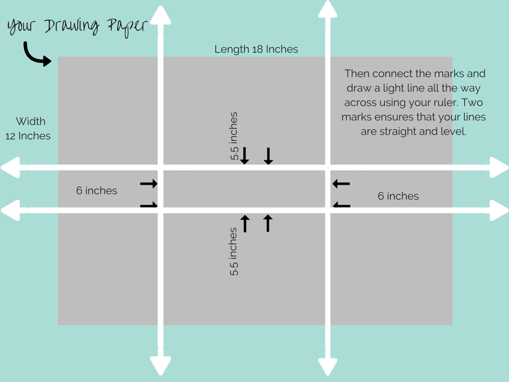
3. Draw two dots on your paper (fairly close together, not more than two inches apart)
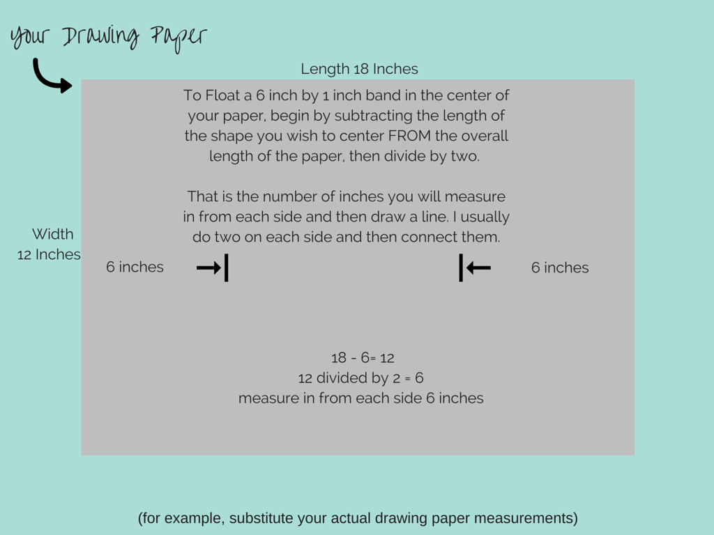
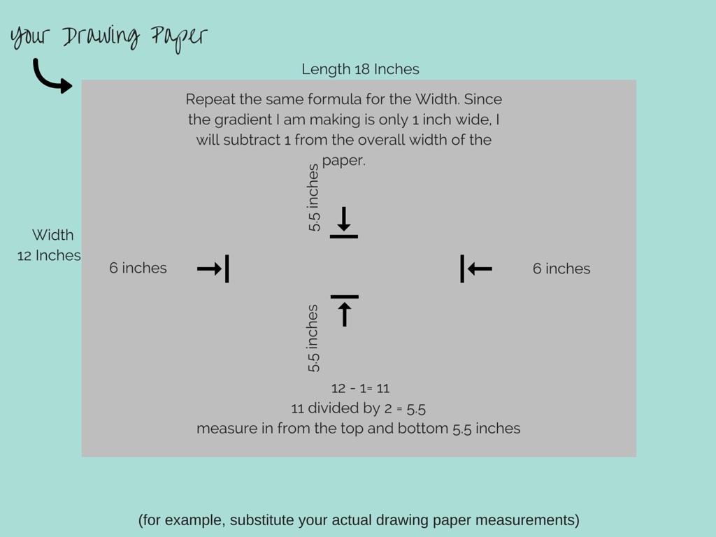
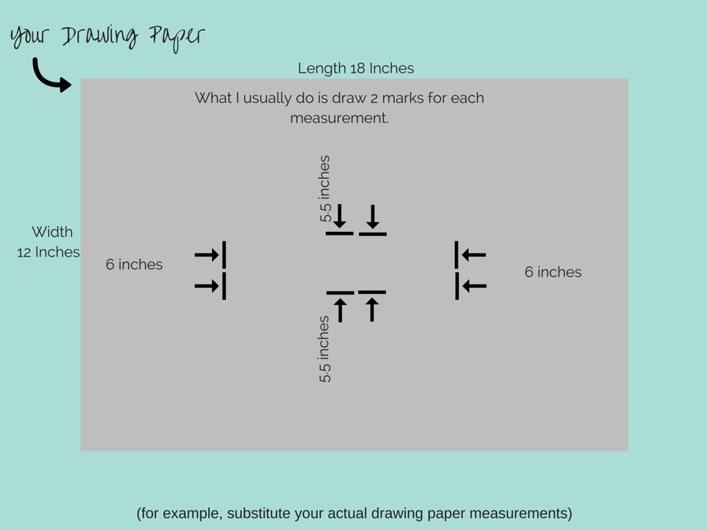
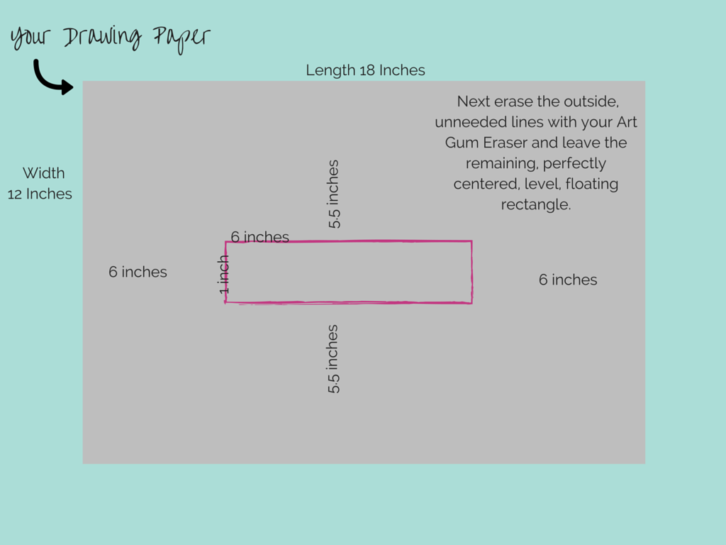
4. Create a 6"X1" rectangle centered in the middle of your drawing paper (follow the photo guide below for doing this).
1. Place drawing paper on your drawing board or smooth drawing table
2. Get out your range of pencil, ordering them hardest to softest (F, 4H, 2H, H, HB, 2B, 4B, 6B)
3. Draw two dots on your paper (fairly close together, not more than two inches apart)
4. Create a 6"X1" rectangle centered in the middle of your drawing paper (follow the photo guide below for doing this).
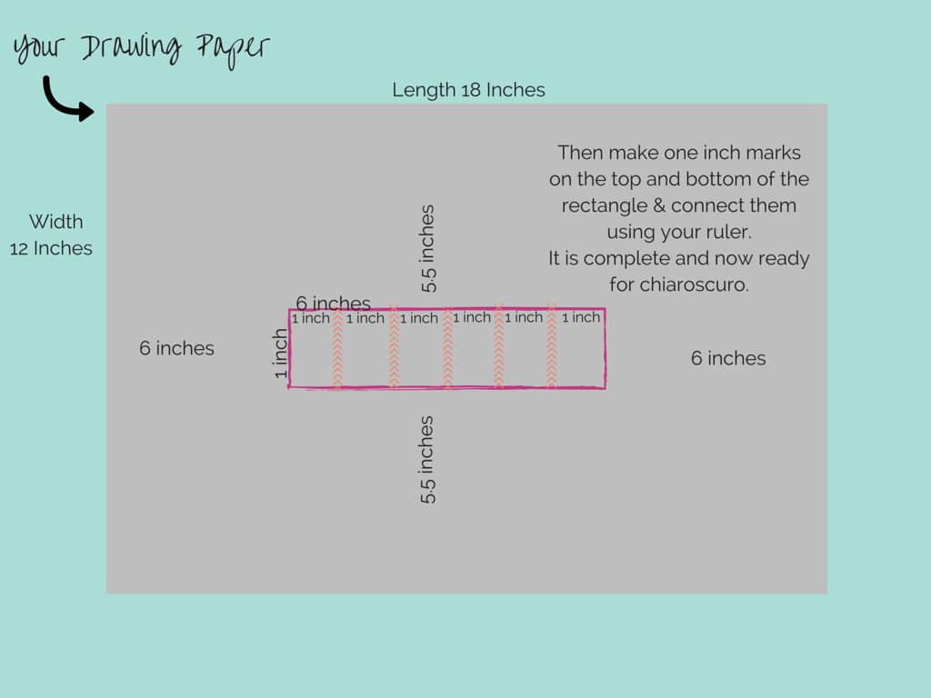
5. Begin with the hardest pencil in your range of pencils (2H for example) and start in the first box by working the area in small overlapping circular movements, paying attention to the lightness of pressure in your hand as you draw. Fill the entire square with an even area of value.
6. Move to the second square and do the same with your 2H or hardest pencil as the first square. Once complete, begin a second layer on that same square with the next softest pencil in your range, H for example. 7. Move on to the third square and work it in this gentle circular overlapping manner to create another area of value with your H pencil. Once complete add another layer of value to that same exact square using your HB pencil or your next softest pencil in your range. 8. Move onto the fourth square and create three layers of graphite in H, HB, and 2B to increase the darkness of value even further. 9. Move onto the fifth square and create another three layers of graphite in HB, 2B, & 4B to increase the darkness of value even further. 10. Move onto the sixth square and create another three layers of graphite in 2B, 4B, & 6B to increase to the darkness of the value as the darkest on your value gradient. |
Technique Project #4: Three Brush Blending
|
|
Supplies Needed
Your own color wheel (not required, but can be extremely helpful!) Painters Tape Rives BFK Paper (this often comes in 22x30 inches, but you can 'tear' your paper down to make a smaller color study. If you want to get wild and do a huge one, that's OK too!) Acrylic Paint in Red, Blue, Yellow, White Gesso Larger Paint brush for applying Gesso Masonite Drawing/Painting Board Acrylic Paint Brushes( Rounded are better for blending) Spray bottle for Water Rags for cleaning brushes Large containers for water Sandpaper Pencil & Rule for drawing edges |
Goal of this project
To increase confidence and fluidity in the color mixing process. To begin to work with multiple brushes and colors at one time, while learning "wet into wet" painting technique.
To increase confidence and fluidity in the color mixing process. To begin to work with multiple brushes and colors at one time, while learning "wet into wet" painting technique.
Step-by-Step Instructions
1. Prepare your Rives BFK Paper by tearing it down to desired size for the project, taping down to your masonite board with an inset edge, and completing the gesso and sanding process.
2. Create an extremely simple line drawing on your prepared painting surface that will be the format in which we play with the three brush blending technique.
3. After prepping your painting surface, load your three brushes with three different values (lightness & darkness!) of the blue and white paint mixture.
4. Apply the light blue at the top left of the paper.
5. Apply the dark blue at the top right of the paper.
6. Blend the two together by using the middle blue paint between the two previous blues.
7. Use your paint cloth the clean the brushes when needed because as you blend each brush will be picking up the paint of a different value.
8. Work wet-into-wet, quickly, to blend the colors evenly and smoothly.
9. Go back and forth between the three values to continue softening your blend.
10. Keep the three brushes in hand to have them ready.
11. Continue down the paper blending in this same technique with different color choices.
12. Change the transition from different values to different colors as well, including complimentary colors.
13. Practice as needed to become comfortable with the three brush blending technique and gain confidence in your painting skills!
Design Challenge #2
Deconstruction of a Black Square
Deconstruction of a Black Square
|
|
Supplies Needed
X-Acto Knife Rubber Cement (or some other archival adhesive) Drawing Paper Ruler Hard drawing Pencil (I recommend 2H for drawing Boxes) Cardboard surface for cutting with X-Acto Black construction paper (or drawing paper painted with India Ink) |
Goal of this project
In this project you will explore The Principles of Design using the black paper as the "figure" & the white paper as the "ground". The figure/ground relationship will determine the overall movement, harmony, unity of your piece. Think about not only the types of shapes you are creating, but also the "negative space" you are creating as you lay out the shapes on the surface of the paper. That space is just as important and powerful to your overall design & composition.
Visual Art Vocabulary
Figure- In 2D work, an image that appears to be somewhat closer to the viewer than the background against which it is presented; also referred to as a positive shape.
The relationship between figure and background is variously referred to as "figure/ground", "figure field", and "positive shape/negative space"
Ground- The initial surface of a 2D design. The area of a 2D work that appears to be farthest from the viewer, also called the background or field.
Figure-ground relationship- Relationship of a shape to the material it is imposed upon.
Negative Space- Descriptive of areas of an art work that appear to be unoccupied or empty.
Step-by-Step Instructions
1. Cut out a 3 inch by 3 inch square of black construction paper.
2. Create a centered drawn box of 6 inches by 6 inches on your drawing paper. (use the method to do so learned earlier in this module)
3. Begin cutting your black construction paper into shapes you find interesting.
4. Remember the "rules" of this Design Challenge: You must use EVERY single piece of black construction paper from the 3x3" square. All pieces must be included within the 6x6" overall composition. Pieces of the black paper may not be "overlapped" and they cannot go outside of the lines of the 6x6" box. They can, however, be cut to make them appear to be running outside the lines, by anchoring them to the edge of the box.
5. Play with your designs before gluing them down with the rubber cement. Move pieces around. Create movement in your design. Remember the different types of balance learned in the previous lesson? Here's a chance to try it out.
6. I recommend doing a minimum of three of these design challenges. Make certain each design is different from the one before. Try different types of compositions. Being a designer/artist is all about finding numerous solutions within any situation. Never think you have exhausted all possible solutions. Try as many as possible! Maybe an asymmetrical composition, a symmetrical composition, an energetic composition, a peaceful composition, etc.
7. Remember that rubber cement is a "dry contact" adhesive. You need very little to make it stick, but you do need to coat each surface (the piece you are about to collage & the surface where you want to stick it), wait for them both to dry, them place the collage piece of black construction paper on the surface.
8. Most importantly, have fun & play with this one!
Art Talk #2: The Principles of Design
Visual Art Vocabulary
Design
Harmony
Variety
Repetition
Rhythm
Balance
Asymmetrical Balance
Symmetrical Balance
The Golden Mean/The Rule of Thirds
Approximate Symmetry
Proportion
Emphasis
Movement
Economy
Design
Harmony
Variety
Repetition
Rhythm
Balance
Asymmetrical Balance
Symmetrical Balance
The Golden Mean/The Rule of Thirds
Approximate Symmetry
Proportion
Emphasis
Movement
Economy
After watching the above video, feel free to peruse the slides below for your reference back for definitions and to gaze at the art a little longer!
